I’m an iOS Engineer and Engineering Manager with a passion for building quality products.
I’m an iOS Engineer and Engineering Manager with a passion for building quality products.
05 August 2024
During my childhood, my immediate family and some members of my extended family began a tradition to go vacationing on Cape Cod once per year. This trip is an incredibly fond memory for myself and everyone involved, so it was very exciting when we decided to go back this year for the first time in a decade.
My whole family enjoys games - just about anything for which we can keep score. One routine formed where we’d draw up a tournament bracket on a piece of paper, and everyone would play bocce in the driveway. We would often make this trip during the Olympics, so participants would pick a country to represent as a fun extra touch.
With the return of the vacation this summer, I thought I would upgrade that piece of paper to an Apple TV app. I had a pretty clear scope in mind based on previous years, and about a month or so before the trip, so I felt it would be a good chance to learn a new platform with a concrete goal. The app would need to:
The vacation wrapped up last week, and the Cape Bocce tvOS app produced 7 very fun tournaments. Here is a preview of the app in action:
And here is a full walkthrough of the app’s user experience:
In this post I’m going to write about the aspects of the project I found interesting, and walk through parts of the code, which I’ve open-sourced.
Tuist is a toolchain and CLI meant to help scale Xcode projects. It provides a variety of benefits, but at the core, it generates a xcodeproj/xcworkspace from a Swift manifest.
Bringing in any 3rd party dependency should require evaluation of tradeoffs. Tuist is an opinionated tool, it comes with a learning curve, and “scaling” the Xcode project here is obviously not a goal. However, I’ve been using Tuist for a while now, so the learning curve wasn’t a concern in this instance, and I find the gains to developer experience + velocity so significant that I opt to use Tuist on pretty much any project I can:
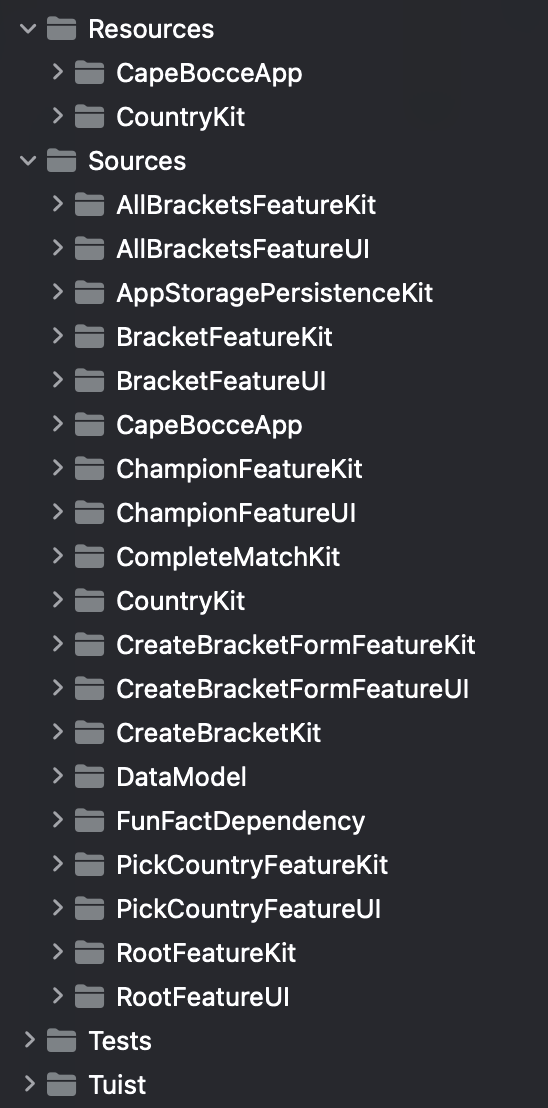
xcodeproj/xcworkspace is generated based on your Swift manifest, they can be added to your .gitignore, eliminating painful merge conflicts.Each folder under Sources here is a module managed by Tuist:

I should caveat that while I’ve used Tuist in a handful of projects, I haven’t migrated an existing project, so I can’t be sure of the difficulty there, but there seem to be detailed docs and some tooling to support that process.
Tuist supports tvOS out of the box, so I went forward with using it here. Another perk of Tuist is, if someone chose to stop using it, that would simply require de-listing my xcodeproj and xcworkspace from the .gitignore, so users aren’t locked into the tool.
Another tool I often like to adopt is The Composable Architecture (TCA), a library by PointFree. TCA can be thought of as a design pattern akin to MVVM or RIBs, as well as the package that supports the design pattern. It prioritizes testability, developer ergonomics, and composition.
Tradeoffs: like Tuist, TCA is an investment at the architectural level with a significant learning curve, but all of PointFree’s libraries have top-notch documentation, sample code, and an active Slack channel for support. TCA achieves a good developer experience and a low level of boilerplate partly through the use of Swift Macros, which do come with a significant hit to clean build time, but the benefits provided by the library, to me, outweigh the cons for most Apple platform projects:
NavigationStack or a TabView, or show multiple features within a screen.The Cape Bocce app has very little test coverage, but were it to be scaled to production, I would add a unit test suite per feature reducer, testing sequences of actions as recommended in the PointFree docs, and add a unit test suite per UI module which tests the UI layer via snapshot testing.
The choice of SwiftUI versus UIKit was easier as I wanted to lean into system UI for most of the app, without fiddling too much. There were definitely a few tvOS-specific learnings, outlined below, but on the whole SwiftUI enabled a sufficient UI with very little code, with some nice animations and customization in select parts. Simply adding a .tint(.indigo) at the root level added a certain personality to the app.
For an app that would be run on a single device, I definitely wanted to avoid any kind of server component to this project. There are 2 data models that require persistence: completed brackets, and a list of recent participants. I figured this persistence would be a good opportunity to leverage a new feature within TCA, the @Shared macro. Not only does this macro enable data to be easily shared across multiple features of the app (automatically listening for updates and reflecting them in the UI), but the data can be backed by a persistence strategy such as UserDefaults or the file system. So I went about storing my Bracket model as JSON in the user’s documents directory, the sensible spot for complex data types like this.
Surprise, a consistent crash on write! Looking up the crash led to this helpful documentation on tvOS app development oddities:
The maximum size for a tvOS app bundle 4 GB. Moreover, your app can only access 500 KB of persistent storage that is local to the device (using the NSUserDefaults class). Outside of this limited local storage, all other data must be purgeable by the operating system when space is low.
A bummer, but in the interest of finding a quick workaround, I checked the average size of my Bracket model, and it turns out that 500 KB limit would be plenty for this use case (enough to store ~40 brackets). So I persisted the models as Data in UserDefaults via TCA’s AppStorageKey, which worked like a charm. Were this app to be generalized and put in the App Store, the right answer would be to use iCloud storage for this data.
SwiftUI tvOS apps do a nice job of managing user focus by default. With no work at all, if you lay out user-interactive controls on a screen, tvOS will seek out the appropriate control to highlight when the user swipes up, down, left or right. However, the primary screen of the Cape Bocce app, which renders a bracket, required some custom behavior:
I think the end result looks pretty good!
SwiftUI’s mechanism for managing focus is the @FocusState property wrapper. It’s generic over a Hashable type, so you can define your own enum/struct to represent the current focus value (or, omit the type to default to a Bool, representing whether self is focused). Like other aspects of SwiftUI, it has the shortcoming of coupling logic to UI, as it needs to be declared inside a View. So, if you are implementing complex logic around focus - like moving the user focus around programmatically - you can bind the UI value to a TCA value, enabling you to even write unit tests around your focus logic.
For the custom styling of the highlighted match, all that was required was adding a boolean isFocused to the match button using @FocusState and using it in the view body.
Regarding making the focus system “smarter” about finding matches to the left or the right: matches are all contained in VStacks, but occasionally with vertical spacing above and below, so what we want is for the VStacks themselves to catch focus, and pass it to an eligible child. That’s exactly what SwiftUI’s .focusSection() modifier is for. By adding this 1-liner to a couple different layers of wrapping container views, focus switching starts working as expected, and all matches are reachable, even if there is nothing directly to the left or right.
As mentioned above, my whole family and I love playing games - enough so that this is not my first software project that modeled a bracket. A bracket contains an array of matches, each of which has two participants. However, each participant could be the winner of a previous match, or the loser of a previous match (link):
public enum MatchParticipant: Codable, Equatable {

    case participant(Participant)
    case awaitingWinner(MatchNumber)
    case awaitingLoser(MatchNumber)

}
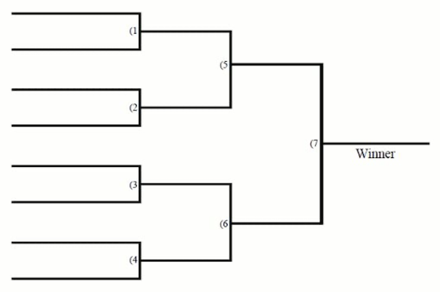
The tricky part is to stitch them together correctly. The base case, where the number of participants is a power of 2, and the bracket is single-elimination, is pretty easy: every 2 participants play against each other, then you pit the winners against each other recursively:

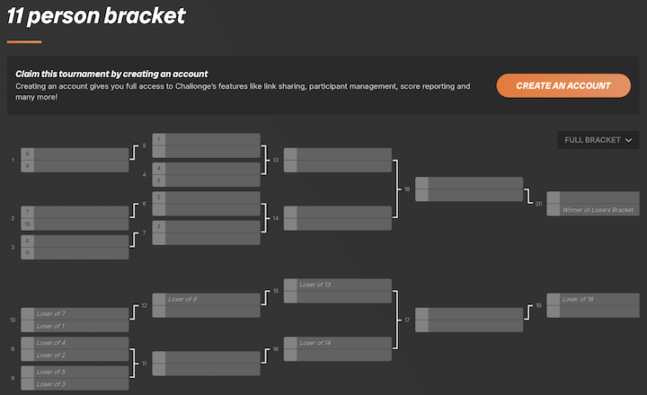
However, it might not be obvious how to generate a bracket with 11 participants (during our vacation, we would have somewhere between 8-13 people participating each day), and it’s probably not obvious to most how to construct the “loser’s bracket” for a double elimination tournament. Even worse, there doesn’t seem to be any literature on this topic that I could find on the internet! I would have to reverse-engineer this process. The website challonge.com was the perfect reference: I could create double elimination brackets for each number of participants, screenshot them, observe patterns and begin trying to replicate the bracket structure.

The resulting source code can be found here. There are some rigid assumptions, including some force unwraps and a static list of powers of 2, which were always valid for the Cape Bocce app use cases but should be cleaned up. There is also some invented terminology: when the number of participants is not a power of 2, the general idea is to play enough matches to reduce the remaining participants to a power of 2 - for example, with 11 participants, if 3 matches are played, we would be left with 8 participants (4 matches), reducing the problem to a simpler case. This first round of 3 matches is called a “filling round,” and then the following round of 4 matches is called the “first filled round.” If this topic is interesting to you, we have that in common! Some future directions will be discussed at the conclusion of this post.
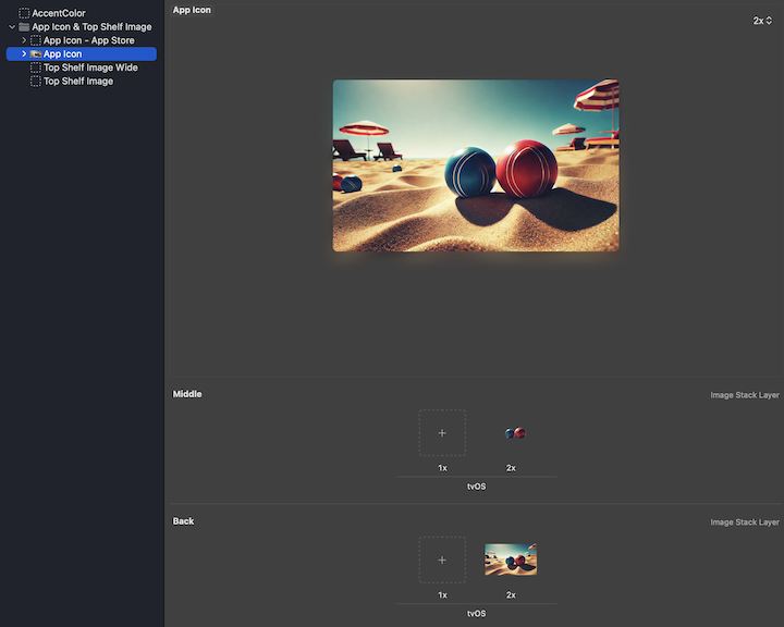
I’m no designer, but I wanted to toss on an app icon for this project. I generated an image of some bocce balls on the beach using Midjourney, and went to drop it in the asset catalog, when I found the tvOS app icon asset catalog is structured quite differently than iOS!

tvOS app icons are composed of multiple layers, which allows for this shimmering effect when you focus on the app. I cropped out the bocce balls and put them in a separate layer:
I would have ideally content-aware-replaced the bocce balls in the background layer, but didn’t get to it in time.
With a few days left before heading on vacation, the project was functionally complete, and I had time to add a bit of surprise and delight. Here’s what I ended up with, when a participant wins a tournament:
I found this open source Swift package for the confetti animation. The binding-based API was a little clunky, but it was easy enough to drop in.
The async-loaded fun fact is a query to ChatGPT whose prompt looks like (link):
system: You will be provided names of countries. When given the name of a country, look up a fun fact about that country. The fun fact should be interesting, family friendly, and at most 1 short paragraph. Do not include any other text besides the fun fact.
user: Provide a fun fact for [country name].
This was a fun and surprisingly easy touch: modern URLSession with async/await makes this integration just 23 lines of code, and wrapping it in TCA’s dependency system means it’s just a function of the shape:
(_ countryName: String) async throws -> String
One could substitute a mock value, a thrown error, or an infinite-loading function in its place during development. Of course, our usage of the gpt-4o-mini model was less than a hundredth of a cent for the week.
I had a lot of fun working on, and using, this Cape Bocce tvOS app. Architecture investments in Tuist and The Composable Architecture worked out well for velocity, and I learned a few nuances to tvOS development. I don’t aim to put it in the App Store, but if I did, I’d probably fix the following first:
I do plan on enhancing the CreateBracketKit module in a few ways, followed by open sourcing it as a Swift package:
Bracket and Participant protocols so that callers could supply their own implementations.Thanks for reading! I’ve also left discussions open on the GitHub repo for any questions about the code.